

HELLOPANDA MANUAL
Slider / WP Swiper

Techniques
One popular tool in web
design is UX Design

References
Marketing and communication
Progressive enhancement

DESIGN
Skills and techniques
01
Slider (external plug-in)
hellopanda WP manual
WP Swiper
The slider in the Hellopanda theme uses an external plugin. It is an active plugin that has been adopted as a popular plugin with the largest number of users and has been continuously updated until recently. Because it is professionally managed, we decided that it would be much more convenient than a little inconvenience.
WP Swiper Gutenberg Block is the most modern free mobile touch slider with hardware-accelerated transitions and amazing native behavior. This powerful plugin is designed for use on mobile websites, mobile web apps, and mobile native/hybrid apps, and offers a variety of features and customization options to help you create stunning slideshows, image galleries, and more.
It may be a little difficult to set up, but you can create an effective design with just basic settings. However, even this can be difficult to set up, so the Hellopanda theme provides most sliders as pre-made patterns. We put a lot of effort into making it more convenient to use.
If you don’t know how to use patterns, we will guide you through the pattern usage guide.
1.
Run the block editor.
2.
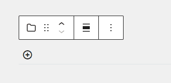
Select the Block Inserter toggle.

3.
Select the slider block.

4.
Add the first slider.
You can add a new slider using the ( + ) button.
5.
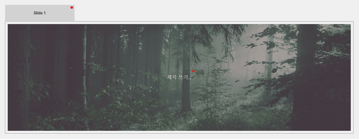
You can freely insert any content, but basically choose a “cover” image and insert it.
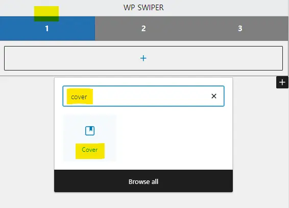
You can add a new slider using the ( + ) button.
6.
Now you can freely edit the contents of the cover.
If you want to insert multiple pages, just repeat item 4.
This is the easiest way to create a slider.
02
Setting the slider details (global settings)
hellopanda WP manual
1.
Slider default style
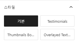
It doesn’t have much meaning, but it’s a good idea to select them one by one and check them.
2.
Overlay settings
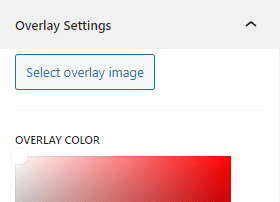
You can choose an image or color to cover the entire slider.
Use this option with caution as it affects the entire slider.
3.
Slider settings (Swiper)
Whether to enable navigation and set icons
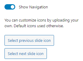
You can decide whether the slider’s navigation is visible and change the images that correspond to the arrow shapes. Wouldn’t it be better to register transparently as a png file?
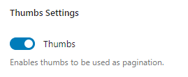
Pagination settings
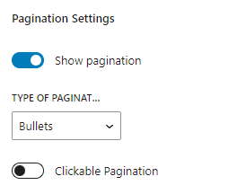
Defines the pagination type of the slider. It supports three options: bullet, number, and progress bar, and can enable/disable pagination. As a small option, there is also a toggle function that determines whether the screen will move when you click on the pagination bullet, number, etc.
Set slider element spacing, number visible on screen
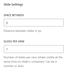
It doesn’t matter if the number of sliders is on one screen, but if you put multiple sliders on one screen, the space between them becomes important. This option is useful for screen transitions where multiple screens are sliding simultaneously. This is a common effect where images are slid two at a time.
Breakpoint settings (for experts)
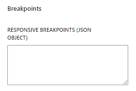
We recommend that this feature be used only by those with knowledge of development. This is a function that allows the slider to be displayed differently depending on the screen size. It must be written in JSON type, and a simple example is provided below.
Example: {“720”:{“slidesPerView”:2}} – Notice the double quotes
Set slider auto height
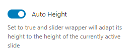
If the height of the slider is different, the height is automatically converted when the screen is switched. The default is enabled and this setting should be effective in most situations.
Set slider direction
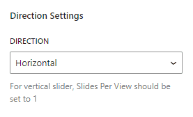
Determines the direction of the slider. However, the effect is applied only when the slider’s screen transition method involves movement. For example, in the case of Fade, direction loses much of its meaning.
Slider core function settings (default)
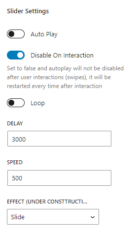
Auto Play ) Activates the function where the slider moves automatically.
Disable On Interaction ) If Auto Play is set, the screen will change automatically, but if there is user interaction (when the screen is moved with the mouse or the screen is switched by selecting a bullet), this is a function that stops the slider screen switching. If the screen moves quickly, it can be hectic, right? This function can solve it.
Loop ) This function sets the end point of the slider element. For example 1 | 2 | If there is a screen transition called 3, if you activate this function, 1 | 2 | 3 | 1 | 2 | 3 | In this way, the screen changes sequentially and infinitely. If you disable it, you will no longer be able to move to the next screen on the third screen and must choose to return.
Delay ) This is the pause time each time the screen is switched. (unit of ms)
Speed ) Refers to the speed at which the screen changes. (unit of ms)
Effect ) Determines the style in which the screen transitions.
03
Setting the slider details (individual element settings)
hellopanda WP manual
1.
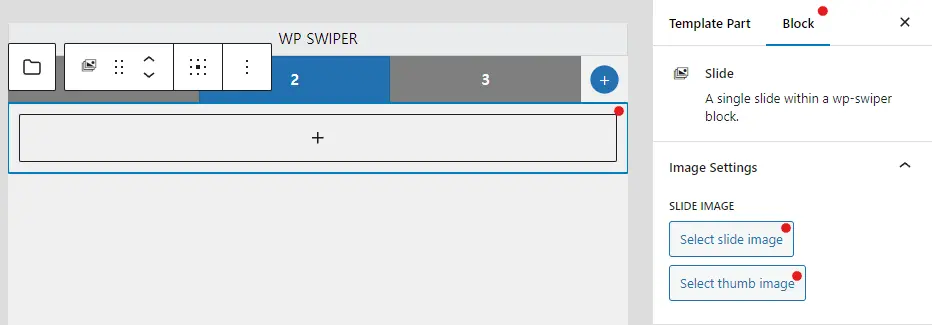
Select slide image
You can choose a default image provided by the slider. After selecting the basic image, you must fill in the content to view the screen. (There is an image, but that’s because it’s the background.) After selecting this image, you can fill in the internal content.
However, this is only provided by the plugin and is not required to be used. Please note that it is fully usable even if you insert an image as a basic WordPress block. If you understand each slide as an area, organizing content will be much easier.
2.
Select thumb image
This is an option to configure the slider with thumbnails. Just adding an image to this function does not immediately display the thumbnail. Please understand that this option is only complete when you turn on the option to display thumbnails in the overall settings. Please refer to the image below.